New York State Comptroller Thomas P. DiNapoli announced today that he has launched an interactive online tool using subway ridership data that details where straphangers are, and are not, returning to the subway system, alongside neighborhood and local demographics, employment and income.
“The subways are the city’s lifeblood. Their smooth, reliable operation is vital to the metropolitan area’s economy. As this dashboard makes clear, the New Yorkers returning to the subways are those who most need it, including many from The Bronx, Brooklyn and Queens who work in lower wage, public-facing jobs,” DiNapoli said. “The straphangers putting money into the fare box right now are the ones who can least afford to lose service or pay more for it. This online tool gives riders, the MTA, elected officials, transit advocates and stakeholders information to guide smart and equitable decisions as we rebuild from the pandemic’s devastation.”
"Public transit riders have powered New York's pandemic response and are hard at work on the city's recovery,” said Danny Pearlstein, director of communications and policy, Riders Alliance. “Just as COVID exposed so many inequities, its impact on transit has varied considerably from neighborhood to neighborhood and station to station. Comptroller DiNapoli's MTA Dashboard lays bare how ridership changed as commuting patterns shifted over the past year. It affords important insight into how communities rely on public transit that can help inform public investments in service and infrastructure as we build back."
“Our immigrant essential workers and families have always relied on the subway system to meet their work and family needs — both before the pandemic and now,” said Murad Awawdeh, co-Interim executive director, New York Immigration Coalition. “As New York begins its recovery, it’s vital that New York state maintain affordable and reliable subway service for our immigrant community members, many of whom have no other means of transportation. We applaud Comptroller DiNapoli’s efforts with the online tracker to ensure that the state’s decisions around subway service are guided by objective data and the needs of community members.”
"We applaud Comptroller DiNapoli for bringing transparency to the state of our transit recovery,” said Marco Conner DiAquoi, deputy director, Transportation Alternatives. “We firmly oppose any MTA service cuts, but it is especially important that subway and bus service be maintained for communities that have been on the frontlines serving New York City during the pandemic and will continue doing so during our recovery.”
“Immigrant, Black, and brown New Yorkers continue to rely on our precious mass transit system, even despite the pandemic,” said Theo Oshiro, incoming co-executive director of Make the Road New York. “The Comptroller’s helpful tool illustrates how central the subway is to this city and why it’s so crucial to invest in strengthening it.”
As DiNapoli’s October 2020 report on the MTA emphasized, ridership has returned slowly since the pandemic shutdown in the city a year ago, but it has fluctuated dramatically from one corner of the city to another.
The dashboard released today provides new information. The quickest return to pre-pandemic ridership numbers is happening in the outer boroughs and in neighborhoods with significant percentages of immigrants, relatively lower household income and relatively higher unemployment. Many residents in these neighborhoods work in jobs that cannot be performed remotely such as healthcare, construction, retail and restaurants. Ridership through major transit hubs, such as Penn Station and Grand Central, continues to lag in recovery and remain far below pre-pandemic peaks.
DiNapoli’s subway ridership dashboard will be updated monthly and can be searched back to the April 2020 height of the pandemic in New York City to show changes in ridership for particular neighborhoods over time.
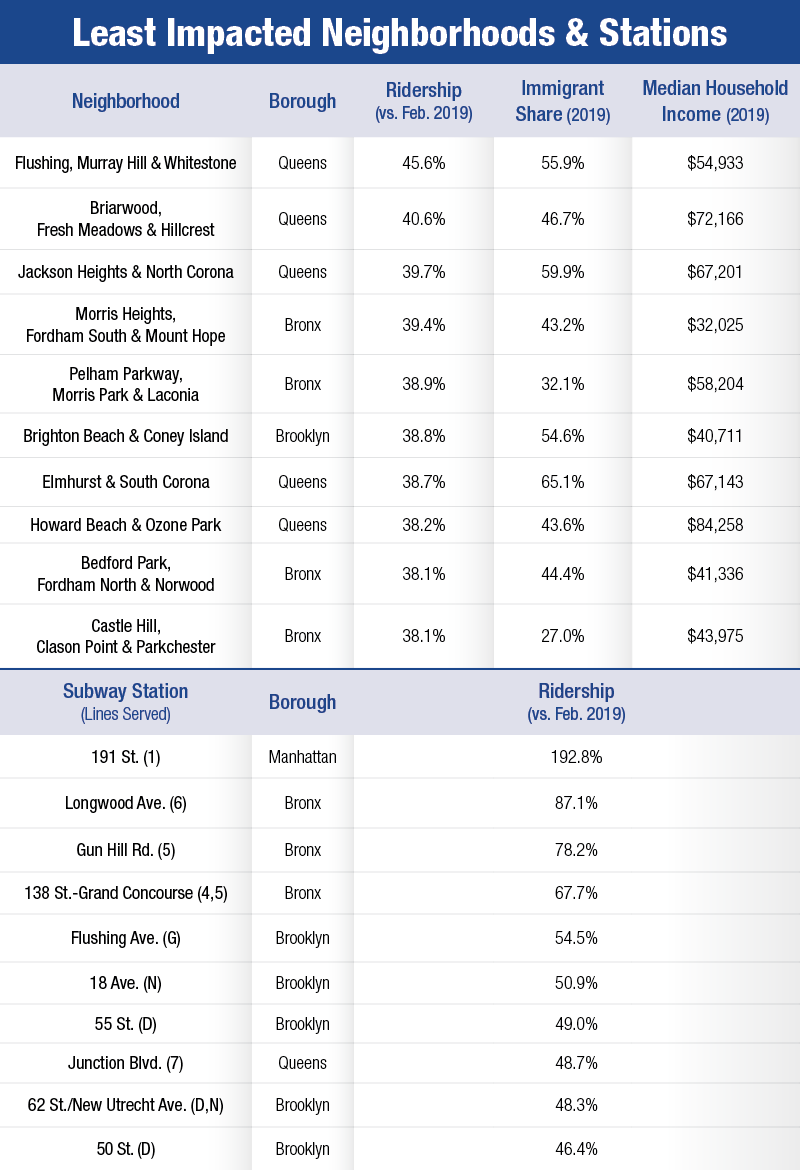
The top 10 neighborhoods and stations where ridership has been least impacted and is closest to pre-pandemic levels (based on Feb. data) are:
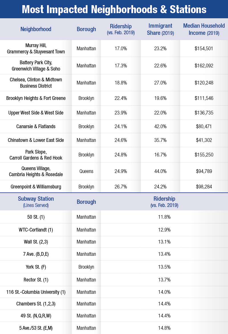
The top 10 neighborhoods and stations most impacted, with the lowest returns in ridership (based on Feb. data), are:
Dashboard
Interactive Subway Ridership Dashboard
Find out how your government money is spent at Open Book New York. Track municipal spending, the state's 180,000 contracts, billions in state payments and public authority data. Visit the Reading Room for contract FOIL requests, bid protest decisions and commonly requested data.